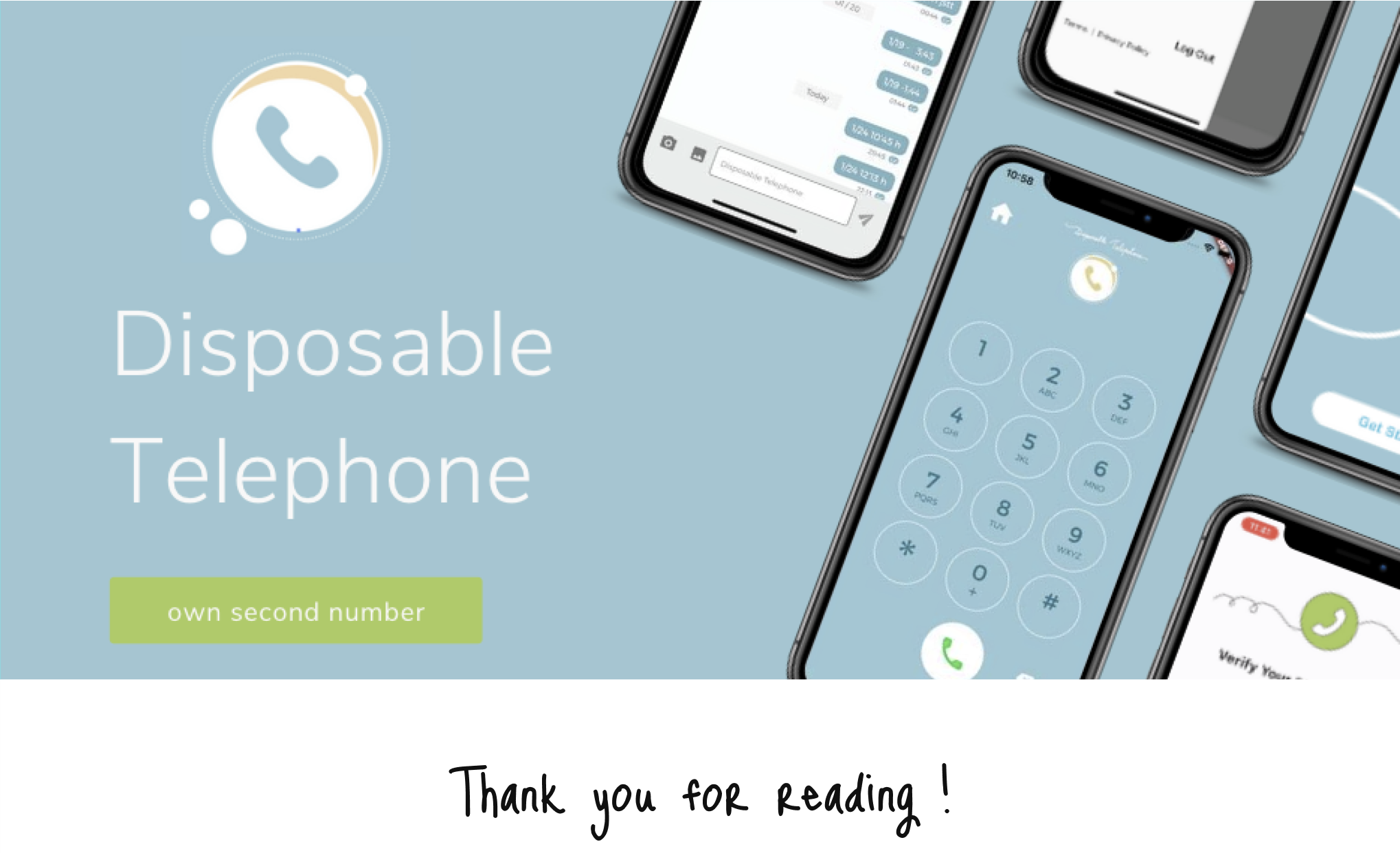
Disposable telephone
Figma / Flutter / Android Studio / Xcode - (2022)
Overview
This app is for people who want to have a second phone number. Most users would use this app for individual business purposes.
This was my very first UI/UX and front-end development project. I joined the team as an intern.
Role
- UI/UX designer
- Frontend development
Team
- Me + 2 members
- CTO: Business & Backend development
- Customer support
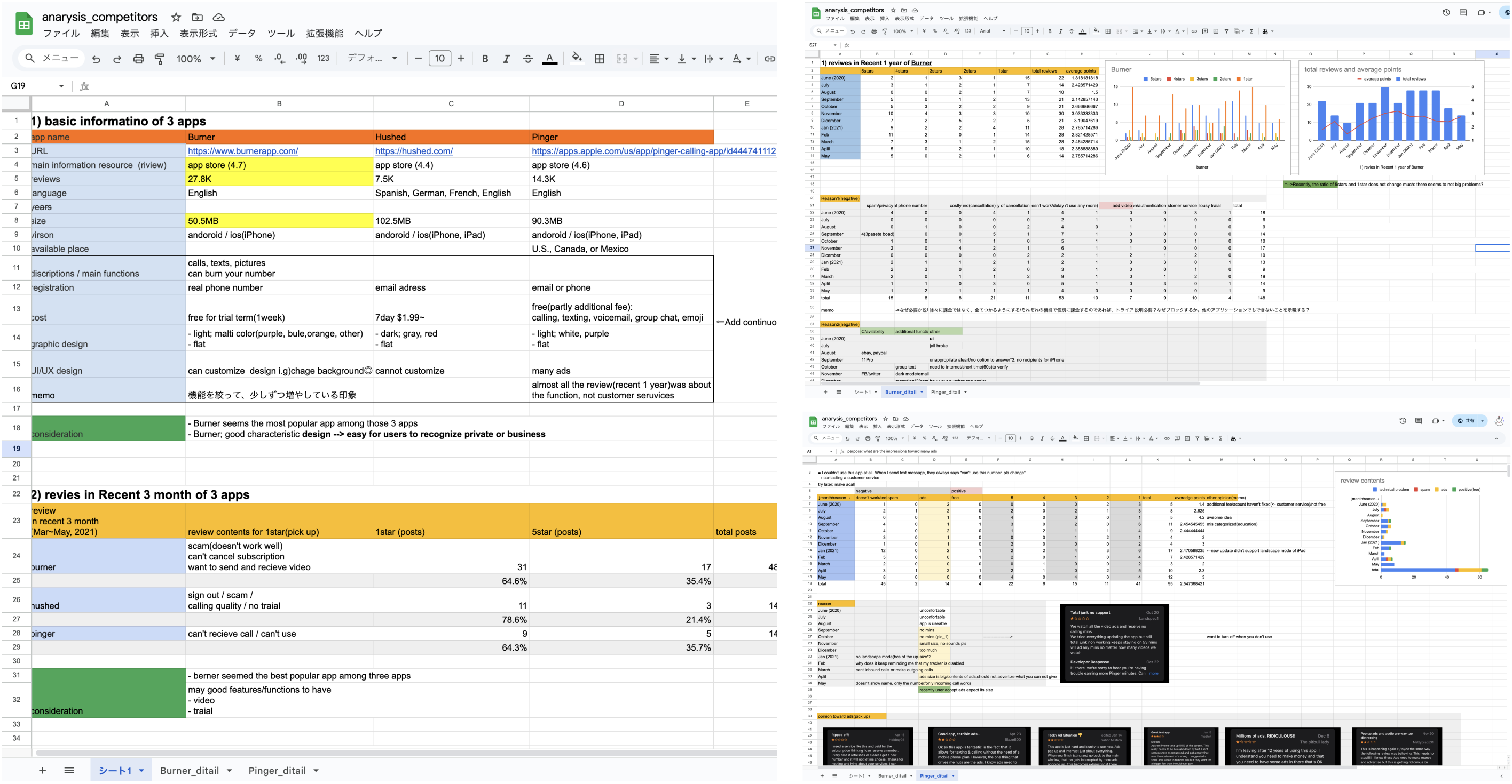
Competitive analysis
-
Reviewed App Store feedback to identify potential user needs and expectations.
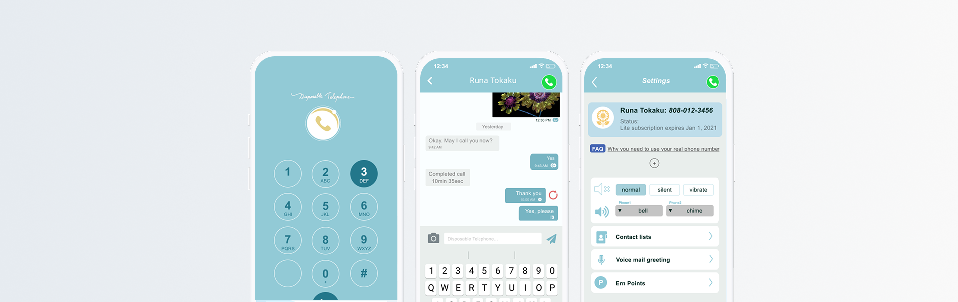
UI
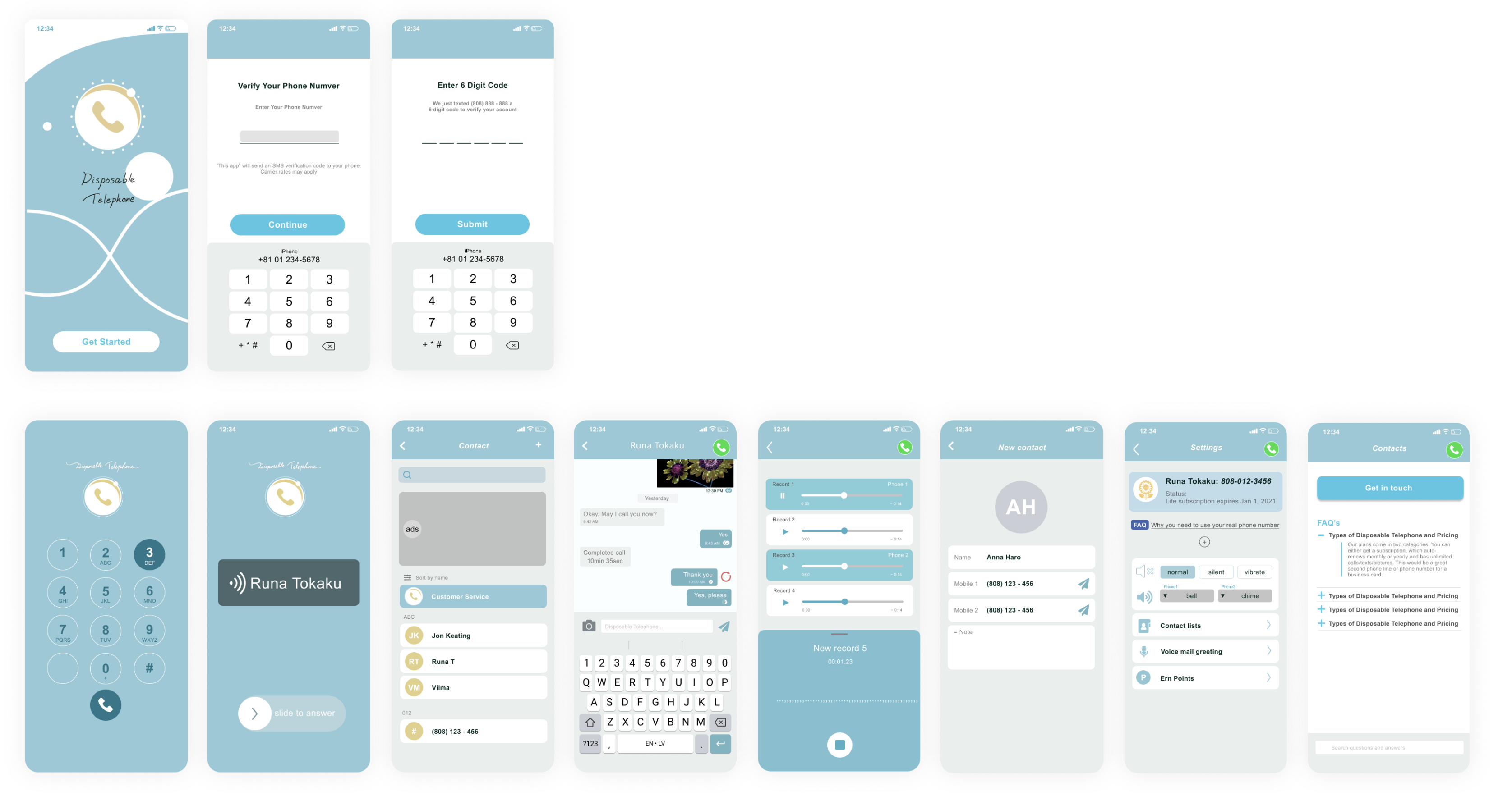
UI/UX design
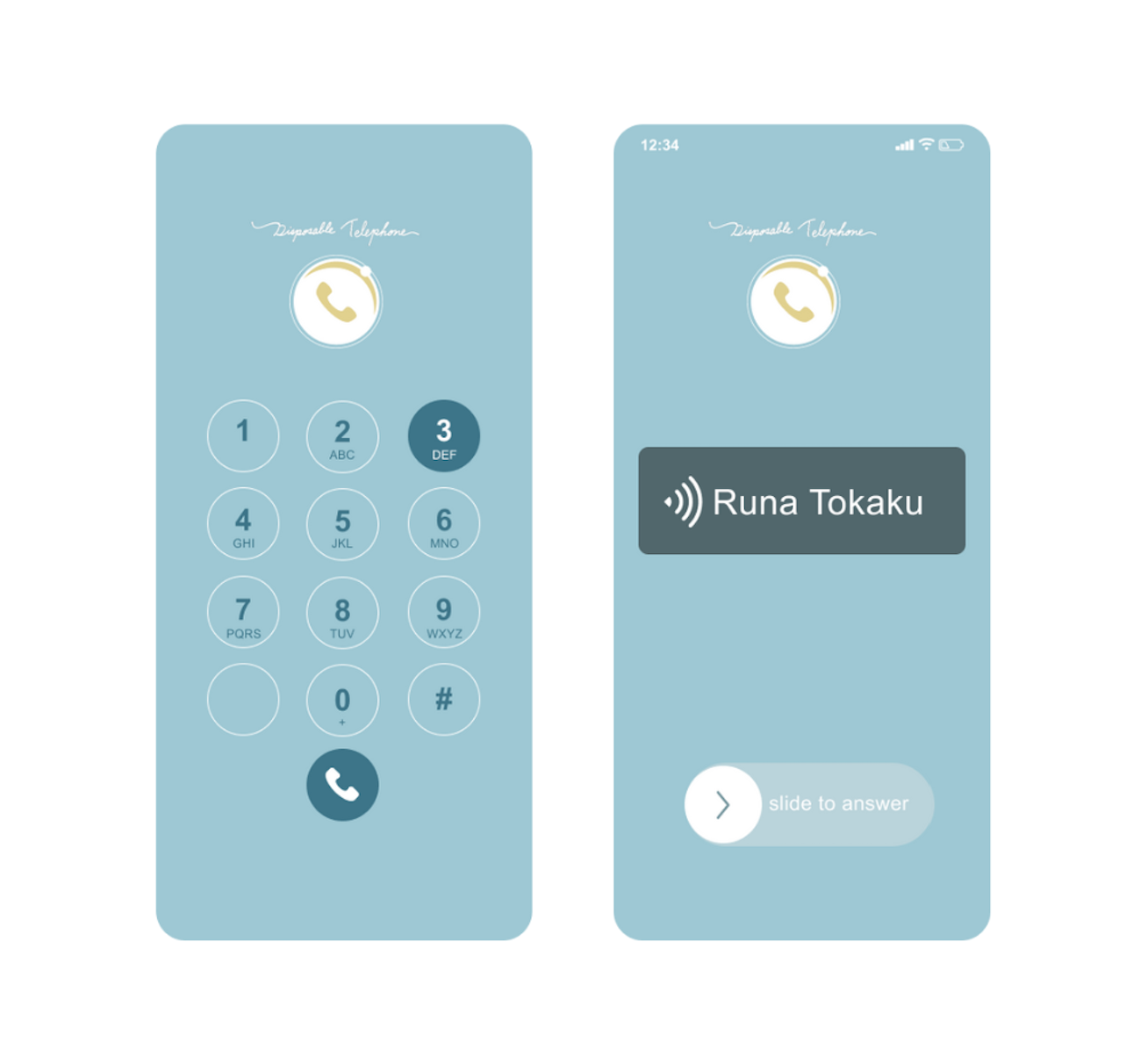
■ Background color for a Better UX
-
The call screen is light blue to clearly signal a business call (from this app) and to support users with a calming, focus-enhancing color during work.
■ Responding to User Feedback on Ads
-
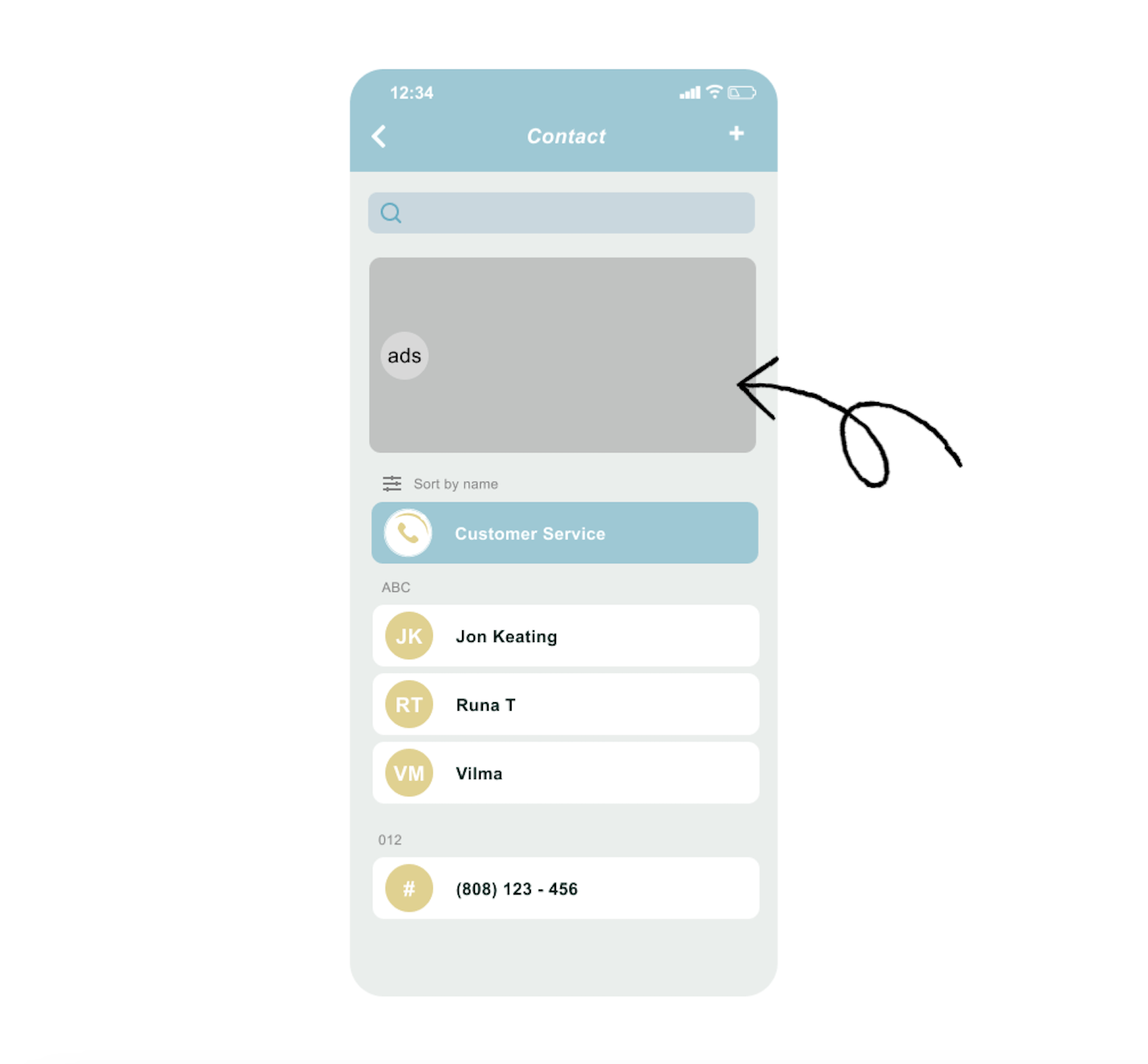
User Frustration with Ads → Avoiding Unexpected Appearances
-
Users expressed frustration with ads appearing unexpectedly during calls. To address this, we ensured that ads only appear on the home screen, not during calls, enhancing user experience and satisfaction.
Accidentally tapping an ad during a work-related call can be a major source of stress — a concern clearly reflected in user reviews.
To provide a more comfortable experience at a low price, we fixed the ad placement in a specific, non-intrusive location.
Accidentally tapping an ad during a work-related call can be a major source of stress — a concern clearly reflected in user reviews. To provide a more comfortable experience at a low price, we fixed the ad placement in a specific, non-intrusive location.
■ More functionality
-
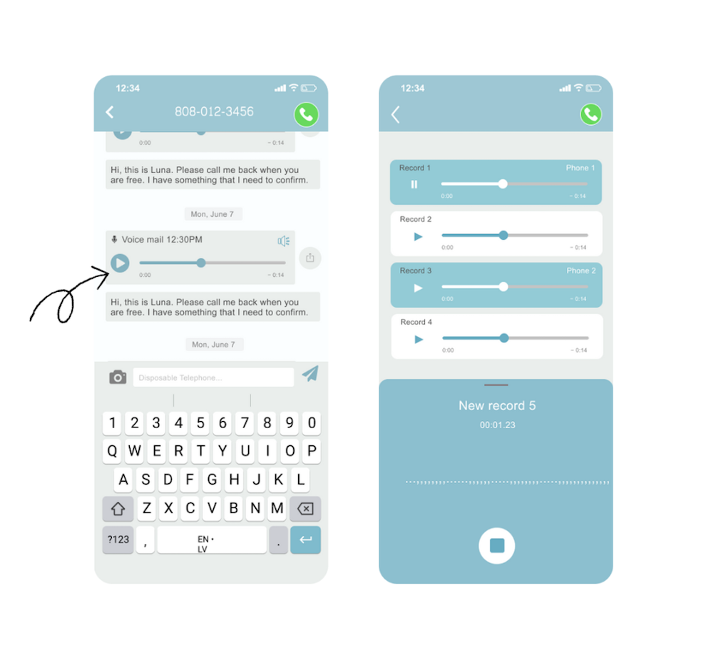
Addition of Voice Message Feature.
Competitive analysis revealed a high demand for voice messaging, leading to the implementation of this feature.
Competitive analysis revealed a high demand for voice messaging, leading to the implementation of this feature.
Feature graphic